monday CRM Pricing: What a 10-Seat Sales Team Really Pays in 2026
monday CRM pricing explained plan by plan, with the real annual cost for a 10-seat team, the limits that push you up a tier, and the costs beyond the license.
Tryve implements CRM and project management solutions for businesses
+32 3 377 78 31 Antwerp - Arnhem - Paris
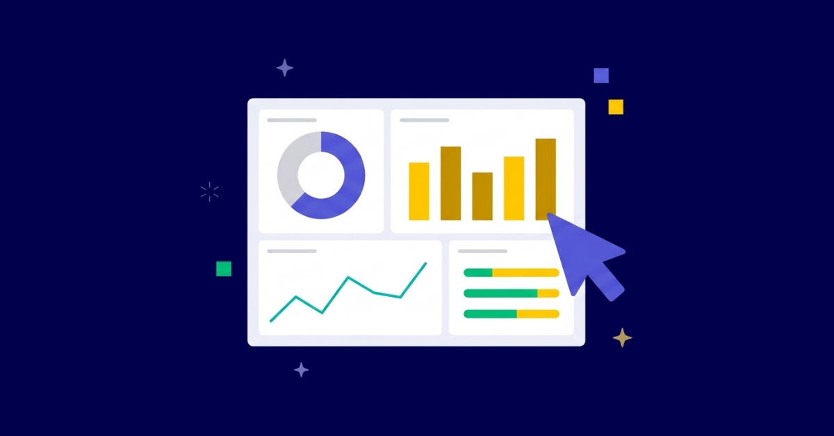
A monday.com dashboard gives your team a live snapshot of what matters, without opening a single board. The key to building one that gets used: design it for one audience, feed it from consistent board columns, and limit it to the widgets that answer a specific decision. If your current dashboards are sitting untouched, the problem is almost always configuration, not the tool itself. This guide walks through every decision that determines whether your project dashboards become a daily habit or a forgotten tab. For expert help with your setup, see monday.com implementation.
Good monday.com implementation treats dashboard design as a discipline, not an afterthought. The way your boards are structured, including column types, status labels, and group naming, sets the ceiling on what any dashboard can show. Getting that architecture right before building widgets is where most teams go wrong.
A dashboard in monday.com is a configurable canvas that pulls live data from one or more boards and surfaces it as charts, numbers, timelines, workload views, and status summaries. It is read-oriented by design: built for decision-makers and leads who need a signal, not the people logging the items.
The important distinction is that a dashboard does not have its own data. It reflects the data in your boards. This means every structural choice you make during board setup flows directly into what your dashboards can display. A Status column with consistent labels can be charted. A free-text Notes column cannot. A numeric Budget column can be summed. A text field that happens to contain numbers cannot.
Most teams think about dashboards after they have already built their boards, and then discover the dashboards are limited by choices made weeks earlier. Reversing that order, planning your reporting needs before locking in your board structure, is the single biggest lever in monday.com reporting quality.
monday.com offers a wide widget library. In practice, most high-performing dashboards are built from a small and consistent set:
Widgets that consistently underperform: countdown timers, freeform text blocks used for announcements, and embedded external content that nobody clicks through. These fill space without supporting a decision. Remove them early.
The most common dashboard failure is building one dashboard for all stakeholders and loading it with every widget that seemed useful during setup. The result is a screen that requires three scrolls, answers no question clearly, and stops being opened within a week.
The fix is audience-first design. Before placing a single widget, answer two questions: who opens this dashboard, and what decision does it help them make? From there, the structure becomes obvious.
This audience needs high-altitude signals: are projects on track, where are the blockers, what is the overall delivery health? Limit this dashboard to four or five widgets maximum. Battery widgets per project or portfolio cluster, a Numbers widget for open blockers or critical issues, and a Chart showing delivery trend over a rolling period. No line-item task detail belongs here.
Team leads need workload visibility and task status by person, group, or project phase. A Workload widget paired with a Chart showing items by assignee and status gives a clear capacity picture. A filtered Table showing overdue or at-risk items rounds out the view. This dashboard sits at the team or department level, not the company level.
A project-level dashboard goes deep on a single engagement: timeline against plan, open tasks by phase, risks logged, and budget consumed versus estimated. This is where the Timeline widget earns its place, alongside a filtered Table of upcoming items filtered by due date. Each project owner should have a dashboard that reflects their specific board setup, not a generic template stretched across every project type.
Start with two dashboards: one for leadership, one for team leads. Expand only once both are getting consistent daily use. Over-building at the start is a common reason teams abandon the whole reporting layer.
This comparison comes up often, and it is worth answering honestly. monday.com dashboards are not a replacement for a dedicated business intelligence platform and were never designed to be.
| Capability | monday.com dashboards | Spreadsheet (Excel / Sheets) | BI tool (Power BI, Tableau) |
|---|---|---|---|
| Live data from boards | Yes | Manual export required | Requires connector setup |
| Cross-board aggregation | Yes, via multi-board widgets | Manual with VLOOKUP or import | Yes |
| Custom calculated metrics | Limited (formula columns help) | Very flexible | Very flexible |
| Visual presentation quality | Moderate | Low (charts are manual effort) | High |
| Access control per view | Yes (board-level permissions) | Limited | Yes |
| Setup without technical skills | High | Moderate | Low |
| Maintenance overhead | Low | High (manual updates) | Moderate to high |
monday.com dashboards win on proximity and speed: the data is live, the setup takes minutes rather than days, and you do not need a data engineer or a reporting specialist to maintain them. Where they fall short is complex cross-system metrics or transformations that monday.com cannot handle natively. In those cases, connecting monday.com to a BI tool via its API or a native integration is the right call, not replacing monday.com.
For the majority of B2B operational teams handling project delivery, marketing, operations, or client work, monday.com reporting covers what matters without requiring a second platform. The gap between what you need and what monday.com provides is almost always a configuration gap, not a capability gap.
Dashboards fail quietly. Nobody removes them; they just stop being opened. These are the configuration decisions that determine whether yours get consistent use.
Standardize Status column labels before building a single widget. monday.com charts aggregate Status values. If your team uses seven variations of “in progress” across different boards (“Active,” “WIP,” “Started,” “Ongoing,” “In Progress,” “Running,” “Open”), your chart is meaningless. Standardize labels across all boards before building dashboard widgets. This is workflow automation and change management work more than technical work; automations can help enforce label consistency once the standard is agreed.
Audit board permissions before sharing any dashboard. A multi-board widget needs permission to read every connected board. When a viewer cannot access a connected board, that widget shows incomplete or blank data. Nothing destroys trust in a reporting tool faster than numbers that do not match what people expect. Check this before a dashboard goes live, not after someone flags the discrepancy in a meeting.
Give every widget a descriptive name. “Chart 3” tells nobody anything. “Open Tasks by Assignee (Q3 Projects)” tells the reader exactly what they are looking at without clicking into it. Every widget title should make sense to someone opening the dashboard for the first time.
Keep critical signals above the fold. If the most important widget requires scrolling, a significant portion of your audience will not see it. Prioritize ruthlessly: the status signal at the top, detail below. Remove anything that is interesting but not decision-relevant.
Walk through the dashboard with the actual audience once before declaring it done. Build it, then sit with the person who will open it weekly and watch them use it. You will learn in five minutes whether the question you designed it to answer is the question they are actually asking. This single step catches more errors than any technical review.
The Standmark case study illustrates what this discipline looks like at scale: 250 projects managed through a dashboard layer built around decision-making, not reporting for its own sake.
Dashboards are passive by default. They show you what is happening but do not act on it. The highest-value monday.com setups use dashboard signals to trigger action through automations.
A Numbers widget showing twelve overdue items is useful. An automation that notifies the project owner when overdue items cross a threshold is more useful. The dashboard provides the picture; automation handles the response. These two layers reinforce each other: you see the trend in the dashboard, and automations ensure the response happens without anyone needing to remember to check.
Time tracking data integrates directly into dashboard widgets when you use monday.com’s native time-tracking columns. A chart comparing estimated versus logged hours per project gives project managers the early signal they need to adjust scope or resurface a conversation about capacity before a delivery slips.
Monday.com’s AI capabilities extend this further by surfacing summaries and flagging items that need attention based on patterns in your board data. This connects to the broader shift in how AI supports project management: less manual status-chasing, more time spent on decisions that require human judgment. The practical implication for dashboards is that the AI features work best when the underlying board data is clean and consistently structured, which is another reason to invest in column standardization early.
The dashboard nobody opens was usually built during implementation, presented in a kickoff call, and never revisited. Nobody removed it. The team just stopped looking at it when it stopped reflecting reality.
The pattern is consistent: dashboards are treated as a one-time deliverable rather than a living layer of your workflow. Projects evolve, teams grow, priorities shift. A dashboard built for a team of five does not automatically serve a team of twenty. A dashboard built around a project phase that ended six months ago is now showing historical noise.
Preventing this is straightforward: schedule a quarterly review of each active dashboard with its primary audience. Remove widgets that nobody references in conversation. Add widgets for questions that keep coming up in status meetings. Rename anything that generates confusion. This is low-effort and has a disproportionate effect on long-term adoption.
If you are inheriting a setup where dashboards are not being used, the starting point is understanding why. Was the board architecture inconsistent, making the data unreliable? Were the dashboards designed for the wrong audience? Were they built without any input from the people expected to use them? A monday.com scan is a structured way to audit your current configuration, identify exactly where the reporting layer is breaking down, and get a prioritized set of fixes rather than rebuilding from scratch.
The platform has everything needed to produce reporting that your team trusts and uses daily. Getting there is a configuration and adoption problem, and that is a solvable one.
Getting monday.com dashboards right is not a one-afternoon project. It requires intentional board architecture, audience-specific design, consistent column standards, and regular iteration based on how your team’s questions evolve.
Tryve’s consultants have built dashboard and reporting layers for project delivery teams, marketing operations, CRM users, and portfolio management offices across Europe. We know which configurations hold at scale and which ones create more confusion than clarity, because we have seen both in practice.
Book a free intro call with Tryve to review your current monday.com setup and talk through what a reporting layer your team actually uses could look like.
Tryve is a monday.com Platinum Partner. Every engagement starts with a structured discovery session built around your actual processes, not a generic template. Senior consultants stay involved through adoption, not just go-live. Book a free intro call.
Tryve is a monday.com platinum partner and helps companies with implementing state-of-the-art project management tools!